Camp Highlander
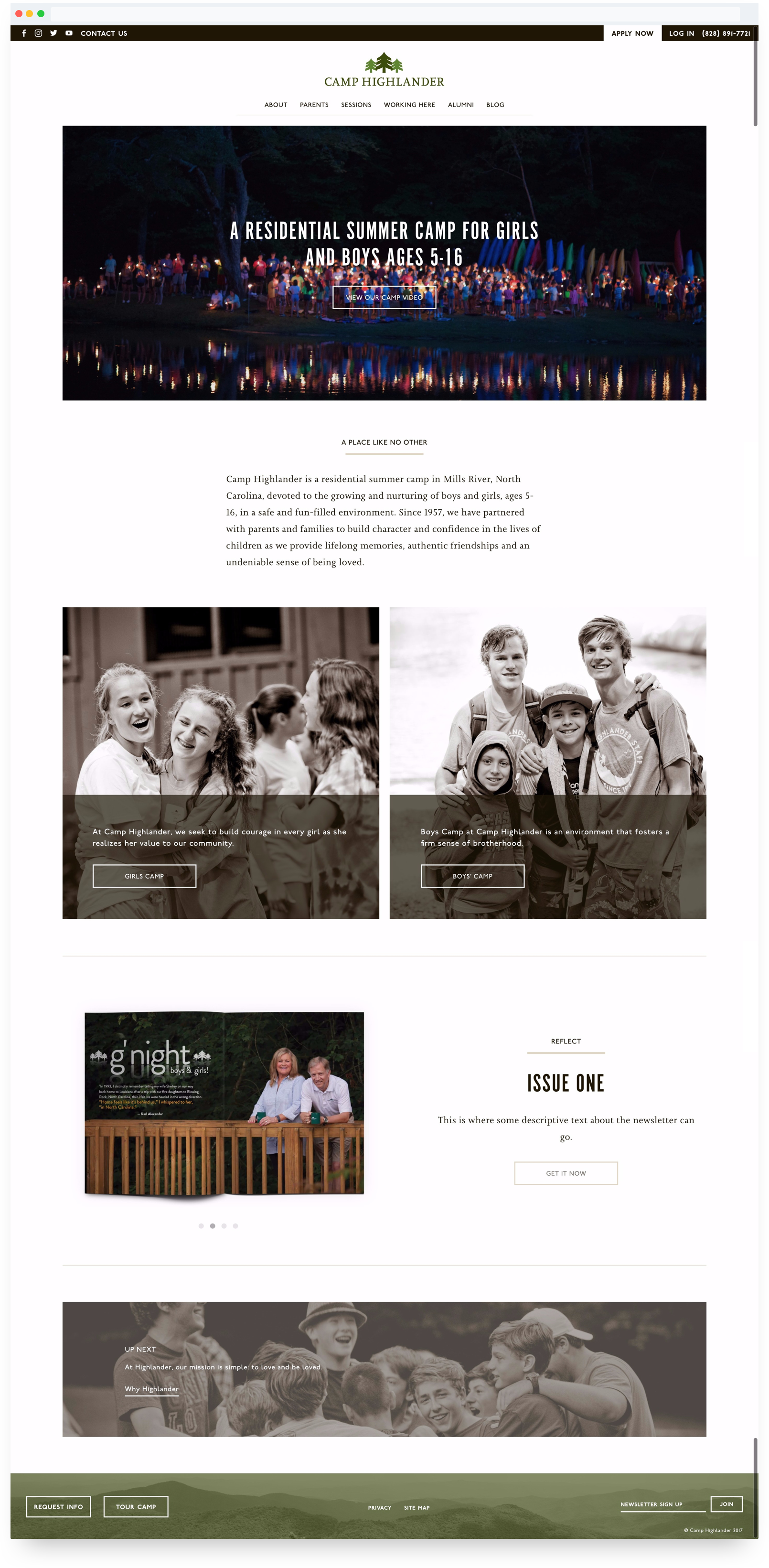
The Highlander website was a joy to design. I love the simple elegance and focus on photography. I also enjoy the amount of portrait oriented photography that will be featured on the site. They transitioned from a busy, in your face design to simple elegance - emphasizing photography and typography.
One challenge this site provided for me was the color palette. Highlander has set camp colors: two shades of green, and two shades of brown. At first, I hated working with these colors, but I was able to find a way to work in the brown and greens in a way that wasn’t painful on the yes. The unsaturated photos with green/brown overlays is a touch that I am proud of.